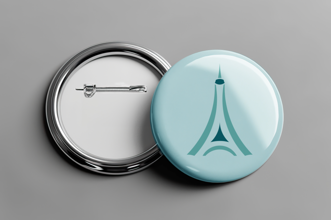
A circle icon is an icon made out of perfect circles. A perfect circle is not skewed in any way. To create these icons, we overlapped circles and used addition and subtraction methods to add or remove pieces of the original circle. The pathfinder and shape-building tools in Illustrator can help achieve this effect.
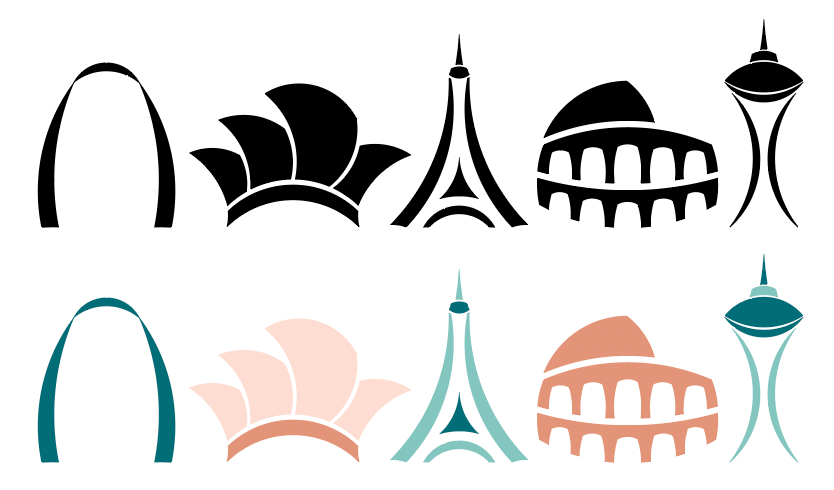
For my second project in Identity Systems, I created five icons using perfect circles. The icons could not be of an object already naturally a circle. The icons could not have letters or numbers. The icons had to be simplified and able to scale to a small size. The icons had to fit into a specific category. I chose the category Famous Landmarks.
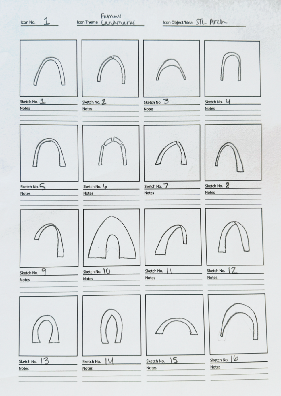
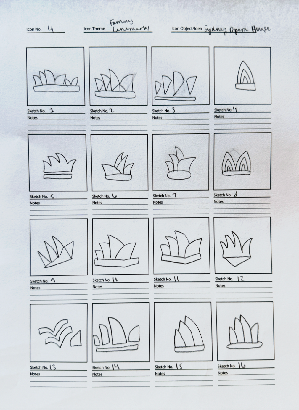
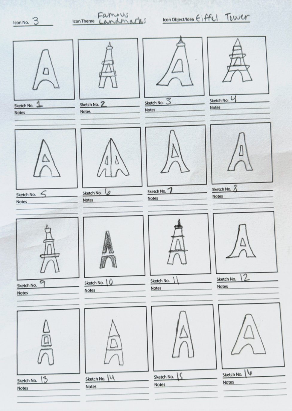
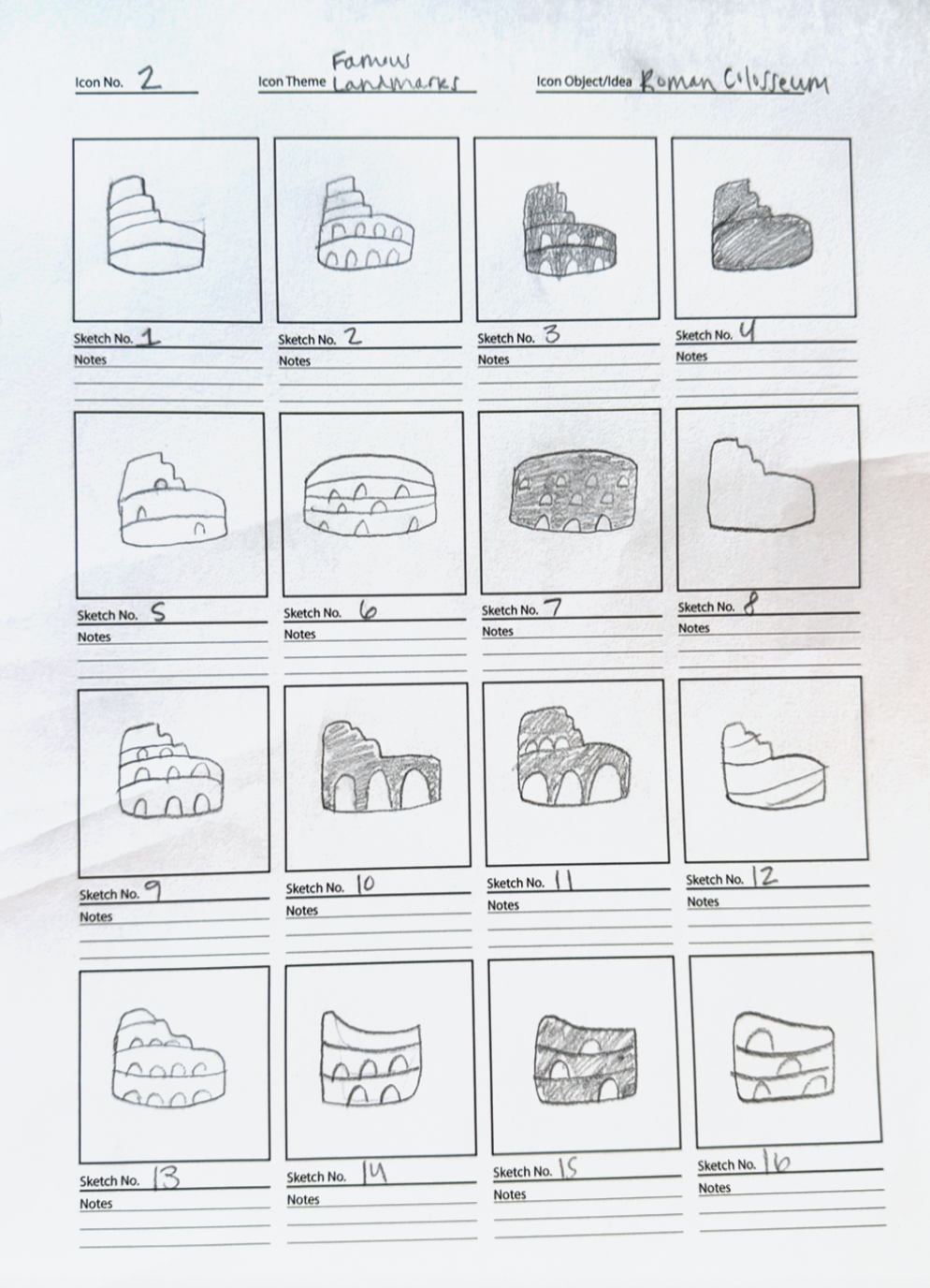
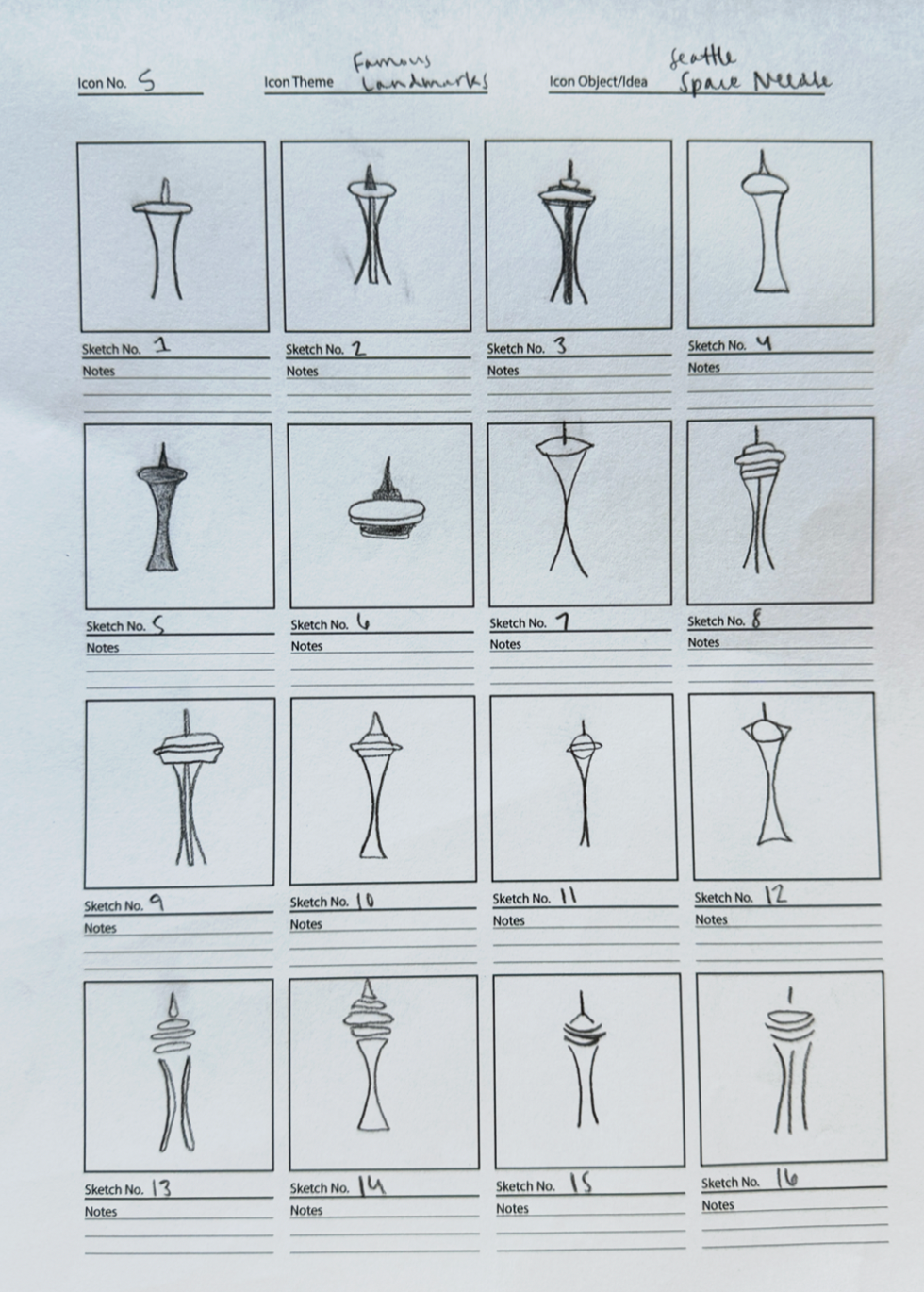
After selecting my category, I decided which five landmarks to make into an icon. I chose the St. Louis Arch, Sydney Opera House, Eiffel Tower, Roman Colosseum, and Seattle Space Needle. I chose three tall icons and two wide icons. I wanted my icons to look like a cohesive set. I began my sketches, but it was hard for me to sketch circular forms. In Illustrator, I started with a couple of circles and just started piecing together shapes. After that, I became comfortable with the circular method and it was easy for me to create my icons from there. We did two rounds of critiques during this project. I made the changes that were necessary after each critique.
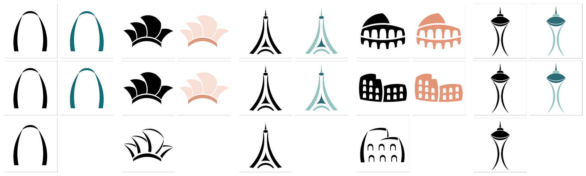
After the first critique, I learned that I needed to focus on having fewer outlined shapes and creating more filled-in shapes. I learned the importance of making simple icons so they can scale to a small size. This will help me with my icon designs in the future. I changed the opera house and the colosseum to simplify them and make them more recognizable. The colosseum was the icon I struggled with the most. It was hard to get the correct angles and make it look like the colosseum and not just a plain building. After the second critique, I found a solution. I am pleased with my five final icons.